Wednesday, April 28, 2021

BRZRKR # 2 review by Anthony Andujar Jr

Publisher: Boom! Studios

Writer: Keanu Reeves & Matt Kindt 

Artist: Ron Garney

Color: Bill Crabtree

Letters: Clem Robins


   As B recuperates from the wounds of his previous mission, U.S. government Doctor Diana Ahuja aims to study more about B’s biological origins. But what is she looking for in B’s past? What is her aim? Is she trying to aid B’s quest for mortality? Or is she trying to use him for a sinister purpose?


      This issue focuses primarily on B’s origins and how he came to be, and it is definitely not entirely what I expected going into some degree. Kindt and Reeve’s add another supernatural element to Brzrkr as a character, showcasing how he developed his powers, and honed his skills as a deadly killing machine. Given that it’s established that B (the titled protagonist) is essentially immortal, I figured it would be something scientific, but now, with this new element to the character, offers potential for the book and its character to go in places that readers may not expect. Despite being an issue that provides exposition to B’s origins, this issue is packed with vicious action, and ruthless aggression. 


    Readers get to witness B’s youth as an uncontrollable child, to a very terrifying teenager that can and will cut through anyone and anything when under the savage influence of bloodlust. This issue was admittedly more fun to read as there is some back and forth between B and government scientist, Diana. Readers get to see a bit of dry banter and some humanity over the course of this issue, complimenting the adrenaline fueled eviscerations that B is able to display from  memory. Part of me would love to see how Kindt and Reeve’s put the script together for this series, simply because it reads as good as an action movie or series (which is currently in development). I wonder what kind of notes were exchanged, what were the writing duties from script, to art etc. 


   While the writing of the book is great, the art is just as good, making this a visual delight to read through. If the first issue was bloody, then the second issue is gutsy. That is all due to Ron Garney’s ability as an illustrator to let loose with enough guts to go around. Much like the first issue, Garney’s layouts are raw, and tastefully brutal as Kindt and Reeve’s writing. The color work by Bill Crabtree is solid, and Clem Robins lettering accomplishes the same, providing readers with a great reading experience. It’s safe to say that this was a great issue, giving readers a bit more and opening more avenues for even crazier story possibilities. Time will tell, but one thing is certain that this is a dope book and worth adding to your pull list for new comic book day

Crossover #6 Review by Anthony Andujar Jr

Publisher: Image 

Writer: Donny Cates

Art: Geoff Shaw

Color: Dee Cunniffe

Letters: John J.Hill


Premise:  The world is on fire, reality is falling apart, along with everybody in it. As Ellipses journeys with the paybacks to reach the Dome, events unfold that will change things forever in this shocking conclusion to the “Kids Love Chains” arc! Will Ellipses succeed in returning Ava home? What will Ellipses discover as she enters the Dome? And for real, who is narrating the book!?


   This series has been a wild ride full of unexpected twists and turns and this issue is no different. Cates does an excellent job stringing readers along Ellipses expedition across this reality bending tale of comical madness. Cates writing is sharp, keeping readers on their toes making the uncertain, certain, and the certain, uncertain. His ability to give readers a plethora of epic scenery, cameos and action, while simultaneously keeping the story’s focus on Ellipses and her trio of friends is excellent. 


    Very often in mainstream crossover  books, the story and characters often get lost in concept and plot that can feel bloated with no pay off or surprise. For a series such as this, it’s amazing how much it feels like it’s namesake in definition and scope, while also being a personal story about one's journey for truth in a world of superhero fiction. Readers will be surprised by the cliffhanger of this issue, and they will definitely have major discussions for days to come about the reveal that Cates writes in that’ll change readers perspective on the events that lead to this issue. 


     Geoff Shaw continues to deliver super powerful work, with dynamic action and visual chaos, living up to the insanity that this title contains. Dee Cunnifee’s color work is energetic, bringing Shaw’s illustrations to animated life. The combination of Shaw’s line work, Cunnifee’s color work and John J. Hill’s lettering provides a bombastic roller coaster ride from start to finish. 


  Everytime I read this book, I ponder how this book could exist! With multiple appearances from characters outside of Image, such as Dark Horse, IDW, Toho, Archie Comics, Bandai etc, it’s hard to fathom such a beautiful collaboration between consented companies. Donny Cates and company continue to deliver an adventurous romp that continues to rival Roger Rabbit and crossovers as a whole. I highly recommend picking up this book and the previous issues that came before it. It’s worth adding to your pull list for new comic book day

Robin #1 Review by Anthony Andujar Jr

Publisher: DC Comics

Writer: Joshua Williamson 

Art/colors: Glen Melnikov

Letters: Troy Peteri


       Damian Wayne bears a heavy legacy as the son of Batman and the heir of the League of Shadows.This time around, Damian forges a new path as Robin, fighting crime on his own terms. Discovering the Tournament of Lazarus, Damian will have to investigate and solve the mysteries behind the tournament, and his legacy.

     Joshua Williamson begins his run on Robin after completing his stellar run on The Flash. Williamson introduces a new status quo that finds Damian in uncharted territory as he comes into his own in this next phase of his career as Robin while adding a new layer to his mythos. Williamson establishes what led Damian to his new status, as he reclaims his crime-fighting identity after the events in City of Bane, where Alfred is gone, and his trust in the Bat-Family is shattered. Reading this new iteration of Damian’s solo series, there is a fresh air of fun and mystery, featuring a new cast of characters that hold some promise as this series goes forward. Williamson explores Damian’s current role and motivations as Robin, while also exploring his character as a young man who’s bound to two clashing legacies. This exploration of the legacy that he bears, while attempting to carve a path of his own as he uncovers the mysteries that lie within the Lazarus Tournament, is a worthwhile journey to read, especially for a new solo Robin series.

     Glen Melnikov does a stellar job with the art that’s delivered in this title. Melnikov’s layouts are dynamic, energetic, and versatile. His ability to fluctuate between art styles, suiting the narrative that Williamson crafts in this series is superb. His color work is just as striking as the layouts he illustrates. The lettering by Troy Peteri compliments Melnikov’s layouts well, delivering a great reading experience. Aside from that, there is one thing I want to highlight: Robin’s uniform.

    The design of Damian’s uniform is fantastic and fits the aesthetic that he has assumed in alternate future stories that his creator Morrison had previously written during his incarnation. The colors fit the mold of Batman but stands out on its own as a Robin uniform. It’s a wonderful culmination of Damian’s Family ties and personality that uniquely suites him compared to his previous predecessors. It’s a wonderful representation of the legacy that he carries as a character. This is a great jumping-on point for a new Robin series, and a great book, with interesting characters and lore that make it a worthwhile read. Definitely add the book to your pull list!

Wednesday, April 21, 2021

Orphan and the Five Beasts #2 Review by Anthony Andujar Jr

Publisher: Dark Horse

Writer/Art/Letters/Colors: James Stokoe 

Genre: Action/ Adventure


Committed to her master’s oath, Orphan Mo sets out to confront the five beasts, former protégés of her master, now overlords of the land. Her first target is the beast of the valley, Thunderthighs,  monster of destruction. It’s going to be a bloody slugfest, but who will be the victor?


    Much like the previous issue, I had one thought that came to mind: Is there anything that James Stokoe can’t do? In regards to the writing, the story is tight, focusing on Mo’s journey of restoring the land from her Master’s former protégés. Thankfully, Stokoe ensured to provide readers with a bit of backstory for the first antagonist known as Thunderthighs. Readers get to witness Thunderthigh’s fall from grace, corrupted by his own power and greed, leaving nothing salvageable for redemption.  


   Stokoe provides a great balance of brutality and humor, but never deviating the stakes that Mo is tasked to deal with. The story wastes no time getting to the nitty gritty, as Mo faces down with Thunderthighs, providing one of the most entertaining fights that can only be compared to Daniel Warren Johnson’s level of caliber, which is a genuine compliment. 


    Not only does Stokoe provide great writing, he also delivers with stellar art and choreography within all his layouts! He knows how to stay in the pocket when illustrating beautiful set pieces  mired in bloody fisticuffs, making this book a blast from start to finish. The battle between Mo and Thunderthighs is both humorous and disgustingly enjoyable that it’ll leave readers hollering near the end in amazement. The color work by Stokoe is splendid along with the lettering making this a fantastic book through and through. 


   If you dig Daniel Warren Johnson’s Wonder Woman: Dead Earth, or Murder Falcon, or if you enjoy anime, or manga such as Beserk, Ninja Scroll, Gantz, Mortal Kombat, and Fist of the Northstar, then this is definitely going to be a delightful read that is worth your while. I can’t stress this enough, go out to your local comic shop, or go to comixology, wherever you can, and get this book. Add it to your pull list! I highly recommend it, heavily. 

Nightwing #79 Review by Anthony Andujar Jr

Publisher: DC Comics

Writer: Tom Taylor 

Artist: Bruno Redondo

Colors: Adriano Lucas

Letters: Wes Abbott


  “I’ve always thought Batman could have done more as Bruce Wayne”


Premise: Having inherited Alfred’s fortune, Nightwing contemplates how to move forward as the defender of Bludhaven. How can he be of benefit to the citizens of Bludhaven beyond the crime fighting? What is Mayor Zucco’s connection to Nightwing’s past? What is Blockbuster planning behind the scenes? And will there be enough dog food for Nightwing’s adopted puppy? 


Writing:     Tom Taylor has an extensive catalogue of books that he’s worked on. Injustice, DCeased, Suicide Squad, are all books that showcase Taylor’s ability to turn any character into someone’s favorite character. In the case of Nightwing, he continues to live up to his reputation, adding new dimensions to Nightwing’s cast of characters and mythos. The rapport between Nightwing and Barbra is wonderfully handled, especially as Nightwing tried to get a handle on being more wealthy than Bruce Wayne, and contemplating how to use that wealth to benefit the citizens of Bludhaven. 


     Personally, I’ve always liked Nightwing more than Batman, simply because he was always meant to surpass Batman both in methodology and personality. He always represented what Batman could be if he balanced out his life in a sustainable way. Taylor provides beautiful moments that show the potential that Duck Grayson could be beyond the Nightwing persona. There is a new antagonist lurking the shadows of Bludhaven and for what it’s worth, has made a heartbreaking debut that promises to make this current arc a worthy investment to read. 


    Much like the previous issues of this run, Bruno Redondo delivers magnificently beautiful layouts. Paired with Adriano Lucas, Redondo’s art just pops off the page with energy and excitement. This may just be the best art that the pair has made thus far in their career! It’s colorful, stylistic and perfect for the story that Taylor and company are crafting together. Of all the DC books that are out this week, this is easily one of the best titles out. It’s worthwhile for any longtime Nightwing fan, or anyone that wants to jump into this run. It’s nice to see Grayson in the hands of a fantastic team of creators that care for this character, while also taking him to new heights, which is where he belongs. Add this to your pull list

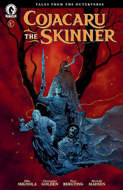
Cojcaru the Skinner #1 Review by Anthony Andujar Jr

Publisher: Dark Horse

Writer: Mike Mignola and Christopher Golden

Artist: Peter Bergting

Colorist: Michelle Madsen 

Letters: Clem Robins

Genre: Crime, Horror


     The year is 1938, An armada of Nazi witches known as the Hexenkorps wreak havoc across Europe. A ragtag group of resistance fighters and white witches band together to thwart the evil coven. Joining together, the resistance summon their best hope to combat against the forces of darkness. The warrior summoned is none other than Cojacaru the Skinner, a spirit whose mission is to free Europe and eradicate all evil witches alike. 


    Cojacaru the Skinner kicks off with a window shattering start, providing readers with immediate investment for the characters and story. Mike Mignola (known for his work on Hellboy)  and Mike Golden (known for his work on Baltimore) are no stranger to the crime horror genre, and with this first issue, they display their prowess of writing historical fiction under the guise of a supernatural horror book. The story is gripping, with characters that have personality, even if they only have brief page time. The protagonist Alexander Gareau, a soldier tasked to deliver a book that he stole from the Nazi’s to aid the allies, is the readers point of view character. Reading the events as it unfolds in his eyes provides an interesting perspective on Cojacaru who is the mythic, headlining protagonist of this book. He’s just a soldier in the middle of a war, but shares the sense of duty that Cojacaru does, even when they have no choice but to accept the call reluctantly. 


    Cojacaru is a solid character that commands the pages as soon as she shows up to unleash hell on any and all evil witches that she comes into combat with. Although we get a glimpse of her past, we don’t get too much to see what she’s like as a person, it ironically adds some mythos to her character, someone who goes into battle, only to leave when the fighting is done. No desire for accolades, just the mission and the mission itself to gain some peace. This makes her a character that readers would desire to know more of. The antagonists known as the Hexencorps are vile, vicious and cruel. Mignola and Golden make them a terrifying group to be reckoned with, and they don’t shy away from displaying that. Given that this is a two issue mini series, it’s a tightly written book that wastes no time pulling readers in to a desperate moment in time, filled with terror and some hope. 


 In regards to the art department, Peter Bergting does a splendid job laying out the pages and scenery. The entire book fits right in the mold of the story, giving the aesthetic and visual flair that story such as this should have. Coupled with Michelle Madsen’s bewitching color work and  Clem Robins lettering, it makes Cojacaru the Skinner a spellbinding reading experience. My only criticism is that for a two issue mini series, it left me wishing that the book was more than 24 pages. If you’re a fan of Hellboy, of Wolfenstein, or The Craft, I think you’lldig this book. It’s got witches, Soldiers, guns, swords, sorcery, horror, fantasy and historical fiction all rolled up into a fantastic burrito of a book! What’s not to like!? I recommend adding this book to your pull list


Tuesday, April 20, 2021

Image Grand Design is finally out!

 Today, the project that a ton of illustrators from various fields, both veterans in the game, and amateurs such as myself, of various styles, places and ages, all came together to make a book you didn’t ask for, but needed. Image Grand Design is out y’all. So many dope creators contributed to this book! This is what I call the infinity war of bootleg, underground comics. What’s even more special? Next month, the Endgame of bootleg comics that’ll be coming out is Image Grand Disaster! I contributed work on Grand Disaster, but don’t let that stop you from coping a digital copy of Grand Design! Grand Design ran so that Grand Disaster could fly! And both books compliment each other. Please do check this out. All of these creators that I’ve had the privilege of connecting with, all worked together throughout the entirety of this pandemic of 2020. It’s a love letter to image comics, a love letter to comic books, @cartoonist.kayfabe and all that good stuff. Definitely check it out y’all. See you in Grand Disaster (coming out in May)! It’s gonna be a literal bloody, gore fest of a time! Special shout-out to @jroamcab @cosmiclion @guanoguycomics @gregory_c_giordano_art and Rocko  for pulling this insane project off! I wouldn’t have met fellow artists @jorge_pazzz and @ericonoronha through the Grand Disaster project if not for this! To work with them and @lord__sanchez for Grand Disaster wouldn’t have happened if not for the existence of Grand Design! If you love indie comics, if you’re a big fan of 90s Image comics, a fan of image, a fan of underground stuff, and stuff of the Piskor Grand Design mold, then what the hell are you waiting for? Plus, proceeds go to the hero initiative to help veterans within the industry to get support they need through tough times. It’s worth your while! 


https://imagegranddesign.com


Don’t forget, next month, the follow up to Grand Design is going to be a:


Wednesday, April 14, 2021

Young Hellboy: The Hidden Land #3 Review By Anthony Andujar Jr

Publisher: Dark Horse

Writer: Mike Mignola &

Thomas Sniegoski

Art: Craig Rousseau

Colors: Dave Stewart

Lettering: Clem Robins


      As Hellboy, and his companions, venture deeper within the island, an ancient being once dormant awakes from its slumber. The vampire known as Vesperra has arisen, setting her sights on Hellboy and his allies. Who amongst them has the means to defend against Vesperra and her undead army? How will this experience shape young Hellboy’s future? 


   It’s fascinating to see that Mignola still invests time and care into Hellboy as a character, putting as much energy into the spin-off series as he has done for the original series. Mignola and Thomas Sniegoski provide another fun entry in this four issue mini series, focusing on a moment in time in Hellboy’s youth, before the iconic paranormal investigator of legend that readers would come to know him as. 


    Both writers craft an amazing tale full of horror, mystery and adventure, that while lighter in tone, is still very much in line with the previous Hellboy series and it’s spin-off B.P.R.D. Young Hellboy is an adorable character that shows glimpses of what is to come despite being a child. His relationship with his father, The Professor is well written, adding another layer to their relationship and continuity as a father/son duo. The antagonist Vesperra is a terrifying vampire of old that fits in the mold of the various monsters that exist within the Hellboy echelon of monsters. She’s powerful, and evil, with no remorse, as all good villains of horror should be. 


   The art by Craig Rousseau is wonderfully fitting for this series. Rousseau’s layouts and aesthetic preserve the visual flair of the Hellboy brand while also being its own, complimenting the story and world that Mignola has expertly crafted throughout his career. The color work by Dave Stewart and the lettering by Clem Robins compliment this layered cake of a book, providing an excellent read for new and old Hellboy fans alike. 


    It’s a fun action, horror story filled with mystery and humor that only a series like Hellboy can deliver. Mignola, Sniegoski, Rousseau, Stewart and Robins deliver a book that I think is worthwhile for anyone interested in those genres, and curious enough to want to jump into the beautiful mythos of Hellboy, without requiring much familiarity with the previous material. I recommend adding this to your pull list! 

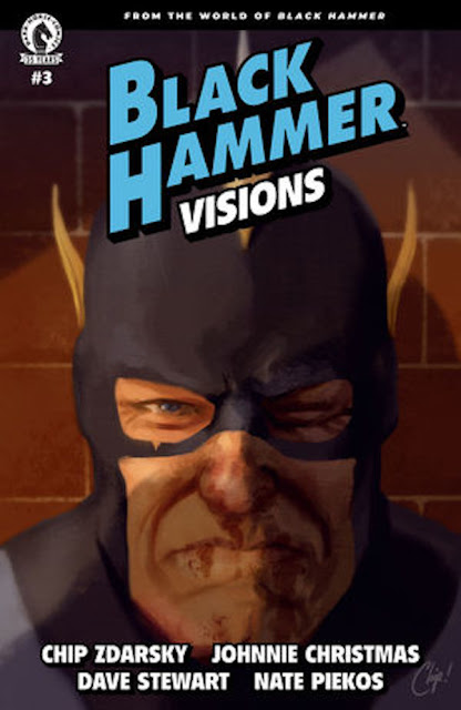
Black Hammer: Visions #3 Review by Anthony Andujar Jr

Publisher: Dark Horse

Writer: Chip Zdarsky

Art: Johnnie Christmas 

Colors: Dave Stewart

Lettering: Nate Piekos


 “... Enjoy your life and your legacy and leave the dumb punch-ups to people young enough to think that’s an answer.”


        Abraham Slam, hero of Spiral City battles a threat unlike any other. And the enemy? Is relevance. With the government implementing replacing Abraham Slam for a new Slam, what becomes of Abraham Slam? Will He fade into obscurity like all underrated heroes of old? Who will be the one true Slam of Spiral City? 


     For anyone that is familiar with Zdarsky’s work such as Spider-Man:Life Story, Daredevil, Sex Criminals, you’ll no doubt be in for a treat. For those that are unfamiliar with Zdarsky’s diverse work, this one-shot story for this anthology series is a great place to start. Zdarsky wastes no time setting up the premise, and digging into the character of Abraham Slam. Zdarsky does fantastic work, building a story around a retired superhero that can’t let go of his former alter ego. Abraham Slam reminds me of a few characters in comics and fiction, a man that’s got strong wholesome values, trying to do the right thing in ever changing times where morality is grey and justice is just as confusing. 


I enjoyed the meta commentary that’s very reflective of the 90s era of superhero comics, where classic golden age heroes were often replaced by new, extreme versions of them. Even though this comic was long in the works prior to Marvel’s Falcon and Winter Soldier series, they compliment each other beautifully. Heck, in some cases there’s elements in this story that Zdarsky beautifully crafts that remind me a bit of Alan Moore’s commentary on superhero nostalgia and Waid/Ross’s Kingdom Come.  It’s a beautifully well written comic that manages to check all the boxes for a great story about growing beyond one’s nostalgia of self. 


Art: The art by Johnnie Christmas’s, is expertly accompanied by Dave Stewart’s color work. Their line work and colors adds another level of depth to this personal yet meta story that Zdarsky has penned. The characters feel perfectly mundane to the world, so when action happens, Christmas and Stewart ensure to stray from ideal superhero fighting, making it brutal and ugly that is fitting to a story such as this. Nate Piekos does a great job accompanying the art with well placed lettering that delivers a good reading experience.  If it isn’t obvious already, this was a very good one-shot story in this magnificent world of Jeff Lemire and Dean Ormston’s Black Hammer. Zdarsky and team strike a home run with this one-shot, making it a worth adding to the pull list. I highly recommend picking this book up


Wednesday, April 7, 2021

Nocterra #2 Review by Anthony Andujar Jr

Publisher: Image Comics

Genre: Horror/Sci-fi

Writer: Scott Snyder 

Artist: Tony Daniel 

Colors: Tomeu Morey 

Lettering: Andworld Design


    Val travels to Neon Grove along with her passengers, in search of some items to help aid her on the journey that lies ahead. Time is against Val as her brother’s condition worsens, making him get one step closer to becoming the very creatures that dominate the dark hellscape that they live in. Meanwhile, Blacktop Bill and his dark forces are following Val’s trail, not so far behind. 


      This issue, Val finds herself in Neon Grove, a port station where ferrymen find supplies left behind by others to recharge their rigs and stock up on whatever items necessary for long trips within this nightmarish world. Snyder spends some time showing more bits and pieces of Val’s backstory before the big “PM” event that transformed the world into the dark reality that it became. Readers get a glimpse as to why Val’s attitudes and philosophies shaped her worldview and decision making. But there are some interesting twists that are revealed that make the journey that Val embarks a worthwhile investment. 


  One of the best things about this issue is the antagonist Blacktop Bill. Snyder does a great job at creating mystery around this character. Whenever he shows up on the page, he just exudes this fear of the unknown. While he may have some personality, there isn’t much known about him, other than what he was hired for, and even then, there isn’t much about him that is revealed, making him a captivating silhouetted antagonist. In regards to the entirety of the issue, it’s a well paced book, taking the time to allow characters and story to play out, developing mystery and tension that lends itself to the world that Snyder and co have crafted. This leaves readers wanting to see more of this world and Val’s journey.


   As for the art of the book, Tony Daniel’s artwork is stunning and possibly might be the best work he has made in his career thus far. Daniel’s line and ink work is accompanied by Morey’s gorgeous color work, making the world of Nocterra a visual feast to read through. The entire art team delivers a lived in world that feels thought out and lived in. And the lettering by Andworld Design compliments the art and writing, making the book a pleasurable reading experience, allowing for everything to breathe. 


Admittedly, this world that the entire creative team has developed, has all the right elements for a video game. It all makes for some interesting stuff. It’s safe to say that Snyder and company are providing a really interesting story that retains investment in where they take Val next in the journey to restore the world. This book feels like a nice return to form compared to Snyder’s later DC work, and one can hope that he keeps the quality and consistency all the way to the very end. Nocterra issue 2 is worth adding to your Wednesday pull list

Bliss #6 Review by Anthony Andujar Jr

Publisher: Image Comics

Genre: Fantasy/Crime

Writer: Sean Lewis  

Artist:Caitlin Yarsky 

Colors: Ari Pluchinsky


    As Perry searches frantically to save his father Benton from the Goddess Lethe, a victim from Benton’s past hunts for him seeking justice. Perry must find the very thing that could save his dad from Lethe’s clutches. What is it that caused the rift between Perry and Benton, and how will the actions of the past affect their future?


    Sean Lewis continues to build on this fantasy story that is very grounded in the themes of regret, trauma and potential redemption. As much as there is a fantasy aesthetic that surrounds the story, the plot and the three dimensional characters that make the book a captivating read. Benton’s actions for what he did as horrible as it is, is something that anyone with a loved one or a parent could relate to. And Perry’s emotional journey and feelings towards his father and circumstances is one that many can identify with. 


    The characters are fallible yet have a charm to them that keeps you invested in their mission to save each other from the terror of Lethe, and from their own pasts. Lewis knows when to plant sparks of humor and drama, making the book a gripping read and almost makes you forget that it’s a fantasy book. And that’s what makes this so Lewis’s writing so great. We get to see what happened to Perry and his father and how the event they suffered from still bare consequence for their futures. 


  As for the artwork, Caitlin Yarsky and Ari Pluchinsky do a great job as an artist/colorist duo. Yarsky’s expressive characters and gesture work gives each character personality and weight, making each character uniquely different from the other. Pluchinsky joins this issue providing color work, and does a great job at preserving the visual continuity that was conveyed in the color work of the previous issues. Both artists create an atmospheric world that feels lived in, and mesmerizing for the reader to follow. 


   For those new to Bliss, or somewhat curious, if you dig the concepts of Eternal Sunshine of the Spotless Mind, Sandman, Breaking Bad or anything related to fantasy of that combination, then this book is for you. I definitely recommend adding this book to your pull list. 

Beasts of Burden #1 Review by Anthony Andujar Jr

 Publisher: Dark Horse

Genre: horror/adventure 

Writer: Evan Dorkin & Sarah Dyer  

Art: Benjamin Dewey 

Lettering: Nate Piekos


    Emrys, the elder leader of the canine supernatural team known as the Wise Dogs, tells a tale about a previous case that he and his then human companion Jonathan Hope investigated during the late 40s. A supernatural curse has been reviving the dead, turning them into disembodied creatures that plague the streets of occupied Japan. Emrys and his team of supernatural investigators aim to find the source of this supernatural plague before it consumes all life. 


    As someone who has never read the previous series prior, it’s safe to say that reading this first issue has me convinced that I should change that. Evan Dorkin has been writing the previous entries of this series for sometime now, and with Sarah Dyer also co-writing this series, they do a great job at making the characters entertaining and the story engaging. The main protagonist is Emrys, an old english sheepdog that is the elderly statesmen of the Wise Dogs group. 


    Emrys is intelligent, knowledgeable and noble, and he has all of these great qualities that make him interesting to follow as a protagonist that happens to be a dog. Some of my fave moments in this book is his relationship with his companion, Johnathan Hope. Dorkin and Dyer do an excellent job at displaying the kind of trust and bond between Emrys and Hope as a human/canine pair, and their interactions with others are entertaining to read.


   Benjamin Dewey handles the art and color work. While his layouts are great, I think what made his work standout more is his color work. Dewey provides the line work with a painterly aesthetic that is beautiful to look at. His layouts provide enough space for the colors to compliment the tone of the book, visually complimenting the narrative as a mystery, horror, adventure comic of its kind should have.


   The lettering by Nate Piekos is well placed, never getting in the way of the art, allowing for both to work in tandem in service of the book. It’s often refreshing to find a book such as this that has the right balance of humor, horror, mystery and adventure all rolled up into one book. If you’re into stories involving pets, Hellboy, or John Carpenter’s The Thing, then you’ll definitely enjoy this book. I recommend adding this to your pull list and I look forward to the next issue. 

Green Lantern #1 Review by Anthony Andujar Jr

Publisher: DC Comics


Writer: Geoffrey Thorne 

Artist: Dexter Soy and Marco Santucci 

Colors:Alex Sinclair 

Lettering: Rob Leigh


      It’s a new era for the Green Lantern title as the book returns with a new series centered on the legendary Green Lantern, John Stewart. The United Planets have gathered to dictate who will be more suited for protecting the cosmos. This leaves the Guardians of the Universe and Oa in a difficult position should they lose their ability as the primary protectors of the universe. With a universal paradigm shift, what will become of the Green Lantern Corps? And how will John Stewart and his crew navigate this ever changing landscape?


   When Geoffrey Thorne was announced the writer of this title, he gained a lot of attention. Whether that helped the book doesn’t matter because right off the bat, Thorne shows that he is a worthy writer on Green Lantern. When it comes to Green Lantern, Hal Jordan has been the headliner that’s always at the forefront. But over the last twenty years, many identify and yearn for John Stewart to headline a series where he can be at center stage. And while he’s had his moments in the spotlight, it usually always dimmed faster than it shined, until now. 


   Thorne kicks off the book with a bang, displaying the current state quo of the corps and Stewart. He plays around with some interesting concepts in regards to the guardians and their place in the universe. For so long they’ve often supervised the universe, but now for the first time, they’ll have a planetary committee supervise them. It’s a fascinating concept that hasn’t been toyed with, and the choices that Thorne makes an engrossing story worth a reader's attention. 


  Personally, I really enjoyed Thorne’s handling of John Stewart and his relationships with his fellow lanterns such as Keli, and Simon Baz. Each of the characters are endearing, with different personalities that feel more like a family than an actual team. And that is a good thing. Oftentimes, the lanterns have always been displayed as comrades in arms, but Thorne gives the lanterns a familial approach that feels more personable and worthwhile to follow. The conflicts that occur within the story in regards to the place of the Guardians, the resistance towards them and the necessities of them shows promise for what Thorne aims to deliver going forward with the series. 


    In regards to the art work, Dexter Soy was a perfect choice to kick start the book. He does a fantastic job providing action with his layouts, giving the book a scale fitting of a summer blockbuster. While Soy does his job in that arena, Marco Santucci delivers in making the courtroom scenes of the United Planets as captivating as the action that both he and Soy deliver. And with Alex Sinclair on color duties, and Rob Leigh’s lettering,  it truly is the cherry on top of this emerald cake of a book. If you’re a fan of John Stewart, Justice League Unlimited, or the Green Lantern’s, but have been out of touch or looking for a good time to jump in, this book is a great place to start! I highly recommend adding this to your pull list this week.